Pastelaria Adega: the pastry case, searchable and one tap from an order.
Pastelaria Adega had an exceptional brand on a site that Google and Instagram could barely read. We rebuilt it around the case itself: every item searchable, ordering one tap away, and the farmers' markets with maps of their own. Between October 6 and October 13, visitors tapped to order 77 times.

October 6 to October 13, 2026, counted.
Numbers last updated October 14, 2026.
An exceptional brand on a site that search engines could barely read.
Pastelaria Adega is the Portuguese bakery of pastry chef Jessica Carreira, from the family behind Adega in San Jose. Its pasteis de nata and malassadas travel to farmers' markets every week. In August 2026 the ordering worked, but almost everything around it was empty:
- The page title was the single word Pastelaria, and the description Google reads was blank.
- There was no phone number or tap-to-call link on the home page.
- The home page linked to no Instagram account, while the bakery's following lives there.
- The home page's code weighed about 440 KB before a single photo loaded.
C+Then24 of 50 on our Website Report Card, August 26, 2026
ANow45 of 50, the same five checks on the live site, October 14, 2026
The five checks, then and now
Our Website Report Card scores every site on the same five questions, each out of 10. Here is what it found on the old site, and the same five questions asked of the new site today.
Then, on the old site
The page title is a single word, Pastelaria, and the meta description Google reads is blank, so Google composes its own snippet.
Now, on the new site
The title now reads “Pastelaria Adega | Pasteis de Nata and Malassadas, San Jose”, with a real description and Bakery structured data with the address, phone and hours. Not yet measured: where the site ranks for a search such as Portuguese bakery San Jose.
Then, on the old site
The homepage's code alone weighs approximately 440KB before a single photo loads, which is heavy even by Squarespace standards. On a phone on a cellular connection, that produces a noticeable delay between tapping the link and seeing the page, and slow first loads measurably increase the number of visitors who leave.
Now, on the new site
Built for phones from the first screen, with order and call one tap away. The home page plays short films of the pastries, so it weighs more than most; that weight and Google's speed score are what keep this check below 10.
Then, on the old site
This is the site's strength. World Famous Portuguese Pastries, a genuine Our Story page, Meet the Chefs, and the Adega family name behind it all: the substance is present, and the site reads as an established business with real credentials.
Now, on the new site
The card's own advice, done: the first screen leads with the bakery's films of its pastries, the family name and the order button, with a story page and the chef.
Then, on the old site
Online ordering through Square works, which is the most difficult part already handled. However, there is no phone number or tap-to-call link anywhere on the homepage, so a customer with a simple availability question has no direct way to reach the shop, and those inquiries frequently convert into orders.
Now, on the new site
Order ahead in one tap from the header and the first screen on Square, with DoorDash and Uber Eats further down the page; call in one tap; directions in one tap; the hours on the home page.
Then, on the old site
The homepage does not link to a single Instagram account, while the family's reputation and the chefs' content are active exactly there. Visitors who would have followed the accounts, seen the farmers market appearances, and returned as repeat customers are given no path to do so.
Now, on the new site
The bakery's Instagram is linked from the home page and every main page, the chef's own account from the story page, and the farmers' markets have a page with maps.
The same phone, the screens a customer needs.
Each pair is the same phone and the same screen. The old site’s pastry photography was never the problem; what it left out was. So the comparison opens where the old site fell short: a customer looking for a number to call, then the menu. Drag across a screen, or use its arrow keys, to compare.
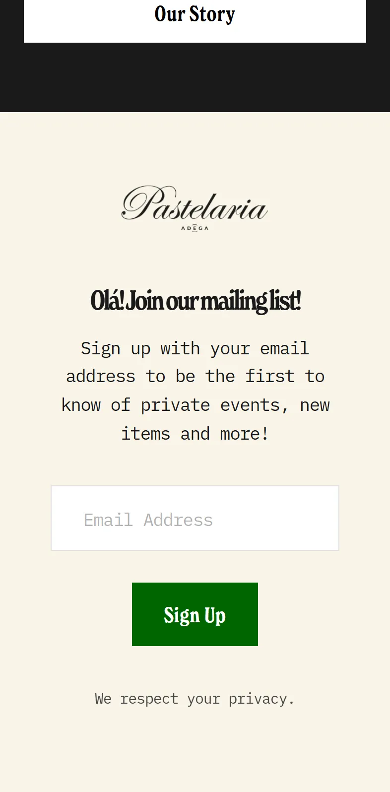
Before, the end of the old home page
- A mailing-list sign-up, and nothing else
- No phone number, street address or Instagram anywhere on the page
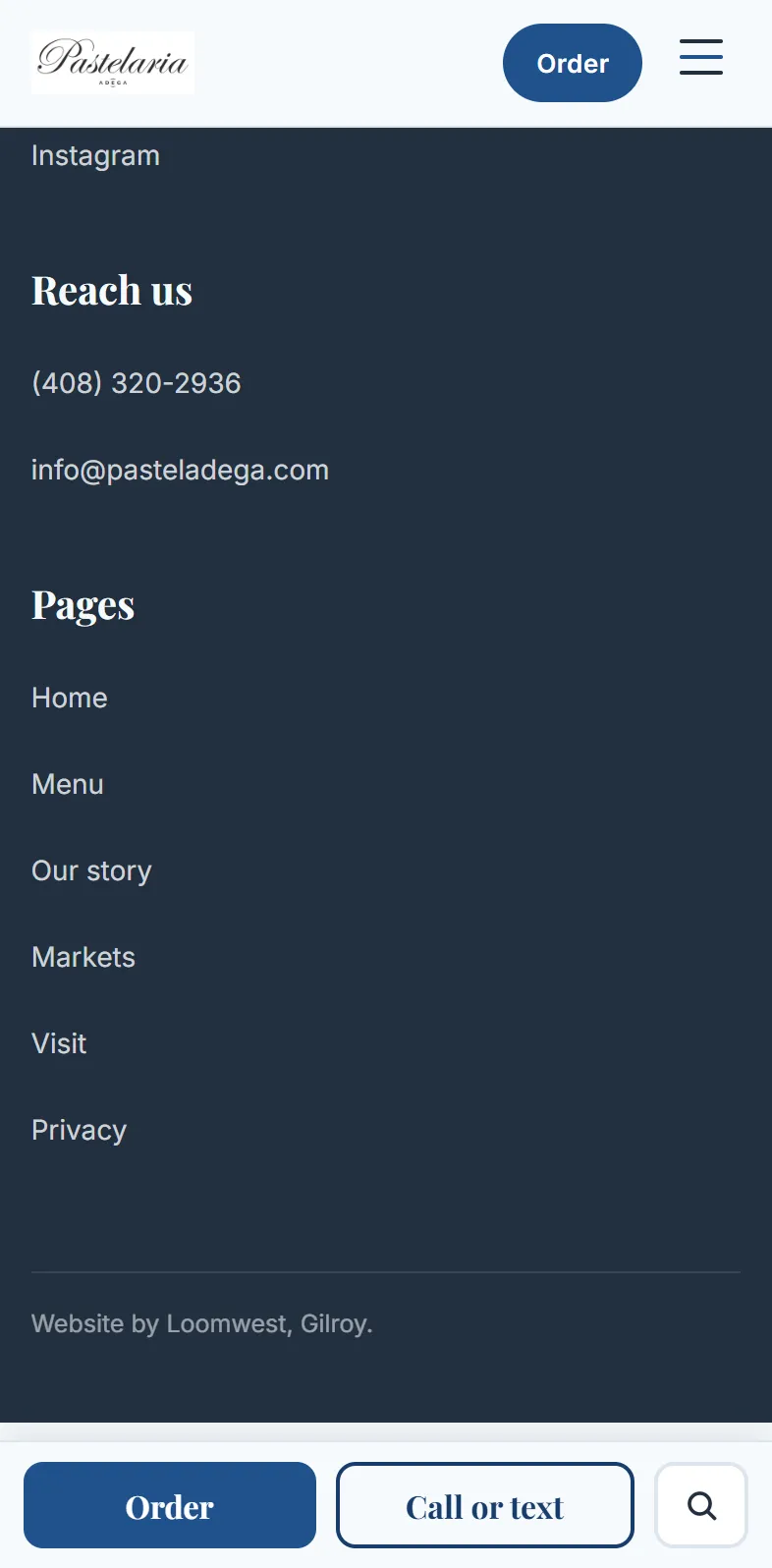
After, the end of the new home page
- The phone number and the email under Reach us
- Instagram, and every page one tap away
- Order and Call or text, fixed to the bottom of the screen
Where a customer looks when they want to call: the last screen of each home page. Before: the Internet Archive’s copy of June 3, 2026. After: the live site, October 14, 2026. Both on the same phone screen.
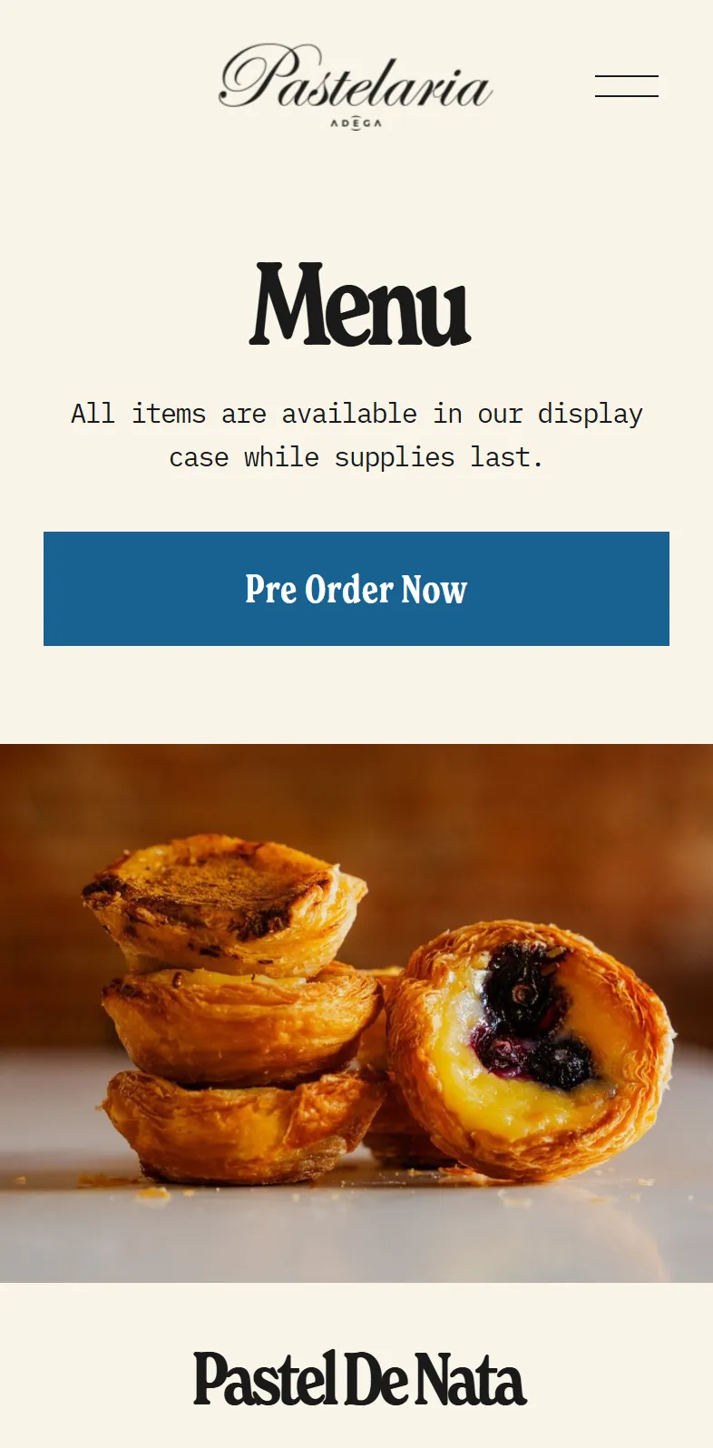
Before, the old menu page
- One Pre Order Now button
- No prices, and no way to search the case
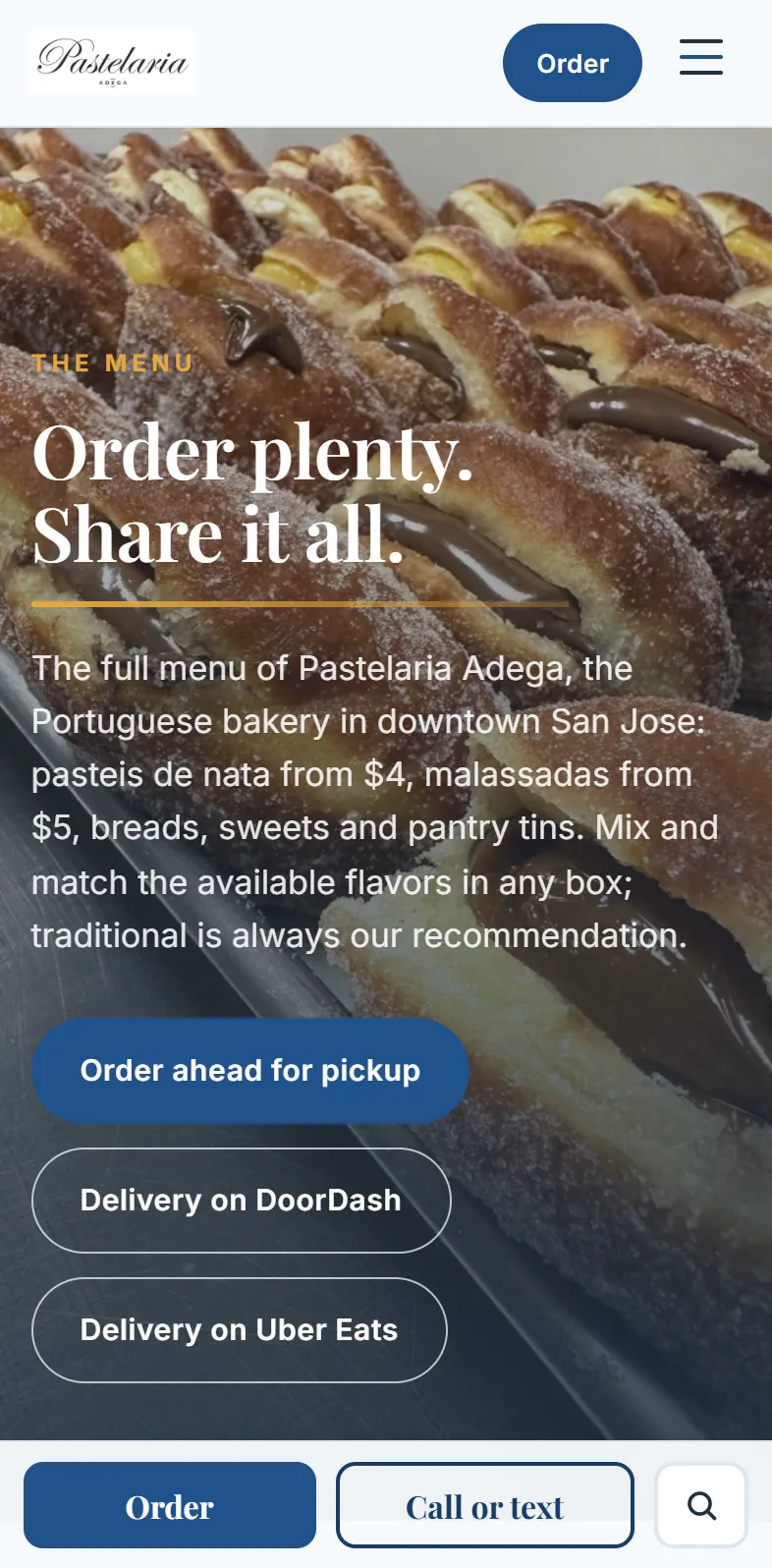
After, the menu page
- What it costs, in the first screen
- Pickup, DoorDash or Uber Eats, one tap each
- A search of the whole case, and Call or text at the bottom
Before: the Internet Archive’s copy of the menu page, August 2, 2025, the latest it saved. After: the live menu page, October 14, 2026. Both on the same phone screen.
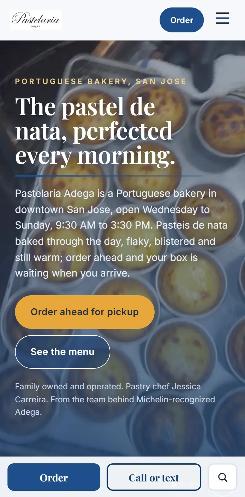
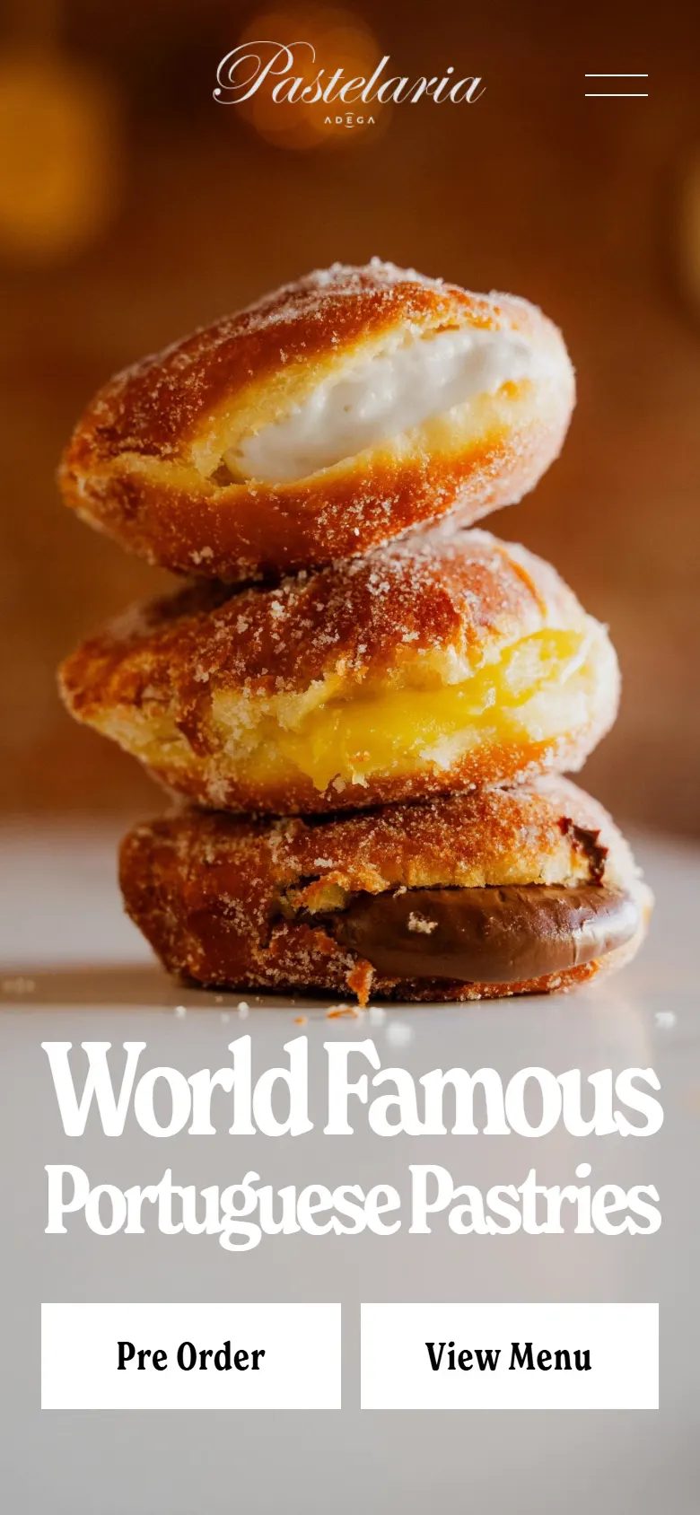
Before, the old first screen
- A one-word page title and a blank description for Google
- No phone number or tap-to-call on the home page
- No link to the bakery's Instagram
After, the new first screen
- Order ahead in one tap, in the header and the first screen
- Call and Instagram on the home page
- A title and description that say what and where
Before: the Internet Archive’s copy of June 3, 2026. After: the live site, October 14, 2026. Both on the same phone screen.
Built around the case.
- The whole case, searchable. Twelve items in four groups, Pastries, From the oven, Sweets and Pantry, with a search that suggests as you type and a photo for every item.
- Order ahead, one tap away. Square ordering for pickup, DoorDash and Uber Eats, from the first screen of the home page.
- The markets, with maps. Japantown and the Diablo Valley Farmers' Market, each with its day, hours, a map and an Apple Maps link.
- Found by search. A title that says what and where, “Pastelaria Adega | Pasteis de Nata and Malassadas, San Jose”, a real description, and Bakery structured data with the hours.
- Connected. Instagram and a tap-to-call number on the home page.

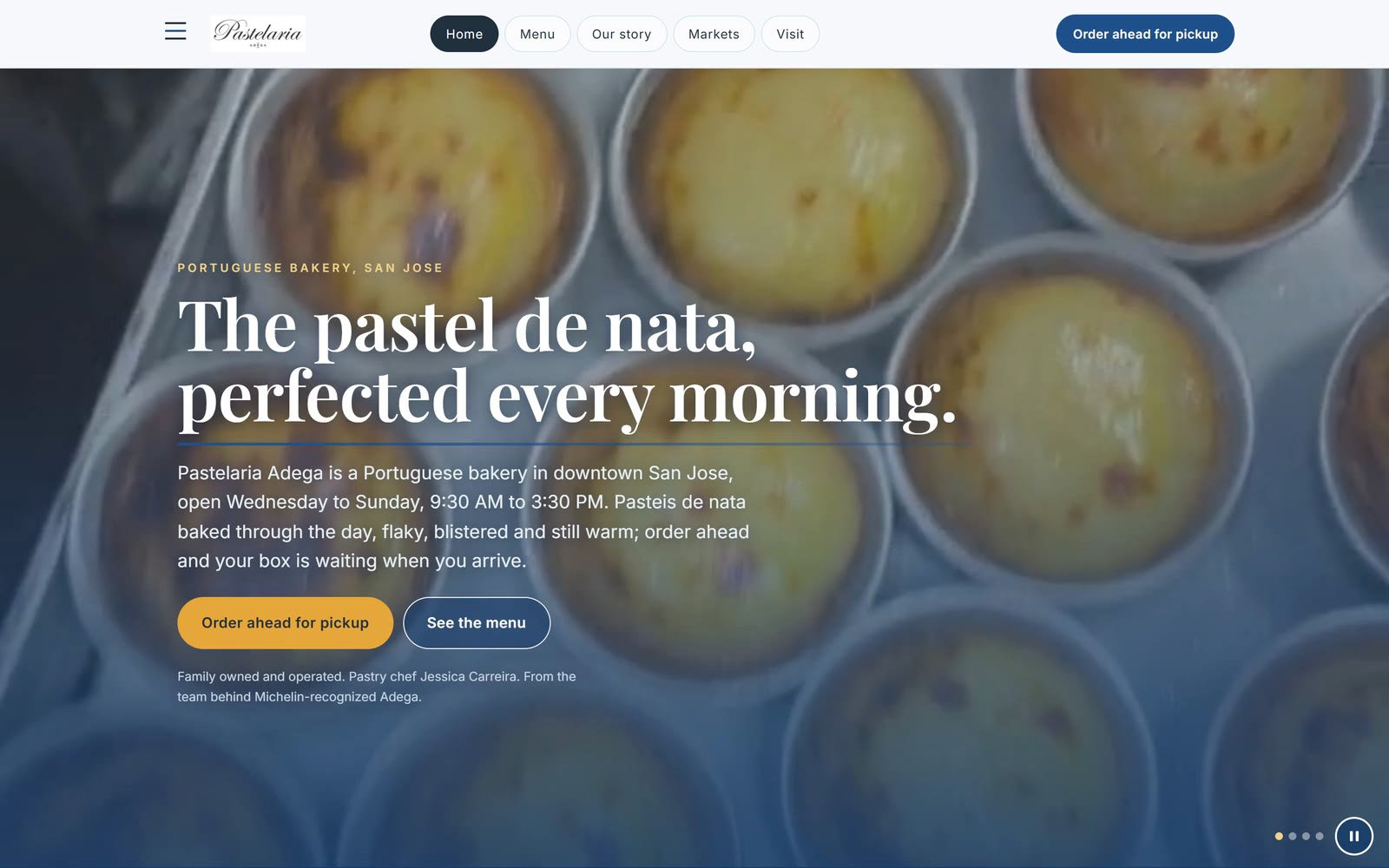
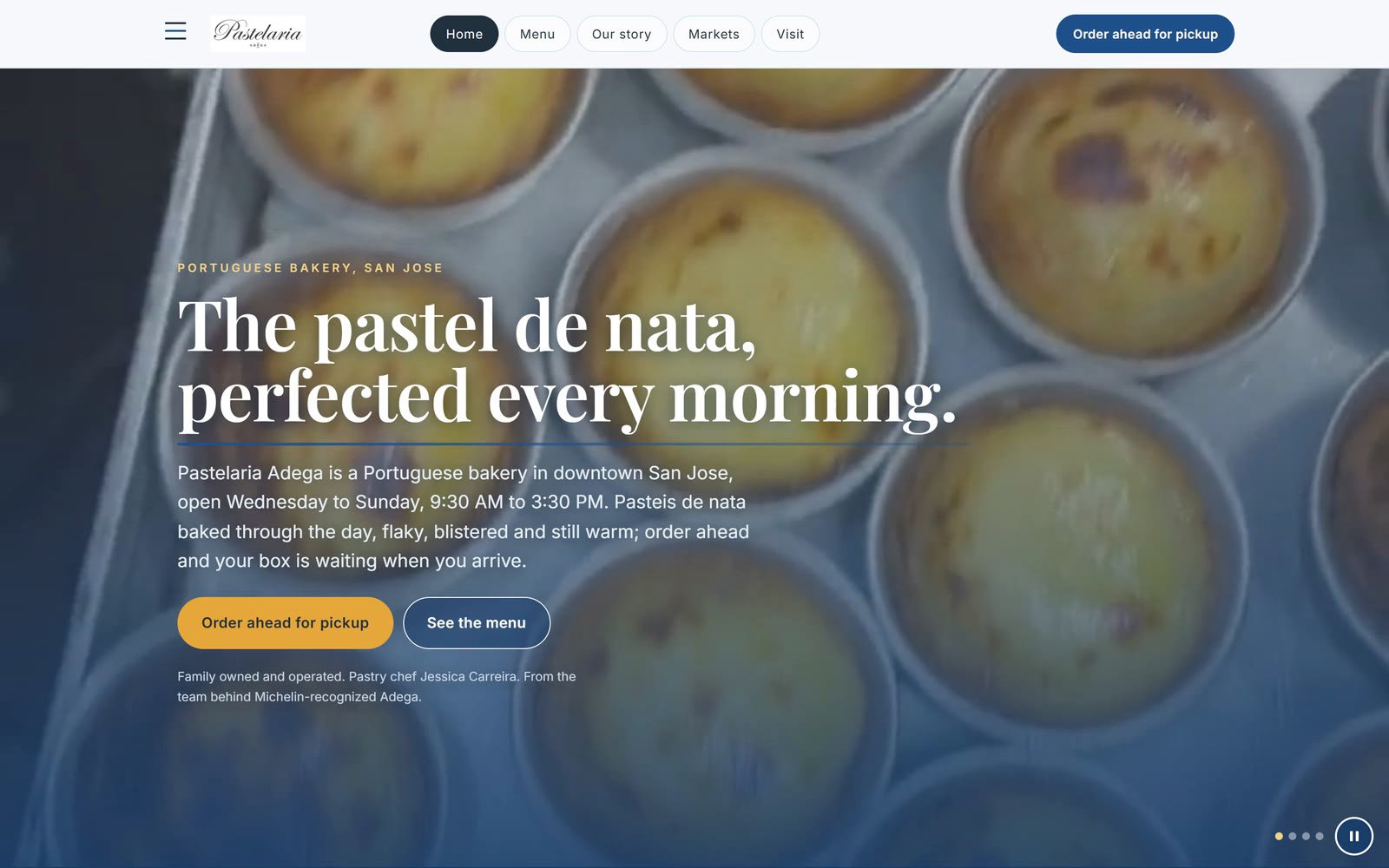
Now A, 45 of 50 on the Report Card’s five checks
The signature: search the case.
A bakery's menu is its case. The site lets a customer search it the way they would scan the glass: by name, by flavor, or by group. Try it here with the twelve items on the site today.
Search the case
The twelve items on the site today. Type a word, such as nata, chicken or gluten, or pick a group.
- Pastel de NataPortuguese egg custard tart, in this month's flavors
- MalassadasPortuguese doughnut, fried to order
- Seasonal specialRight now, the cinnamon apple nata
- Pao de DeusCoconut brioche
- Bolo de ArrozRice flour muffin, gluten free
- Pao AlentejanoRustic sourdough loaf, weekends
- Piri Piri Chicken Pot PiePiri piri chicken in flaky pastry
- Arroz DoceSweet rice pudding
- FlanTraditional flan with caramel
- Sardines in olive oilPortuguese tinned sardines
- Sardines, spicyThe same sardines with a little heat
- Sardines in tomatoIn a tomato sauce
The site’s own search also suggests matches as you type and shows each item’s photo.
Customers find the case, and order from it.
- 432 visits from October 6 to October 13, 2026.
- 87 taps on the site's buttons in the same days, 77 of them to order: 70 on Square for pickup, 4 on DoorDash and 3 on Uber Eats.
- On Google's phone test the site scores 81 for performance, 100 for accessibility, 100 for best practices and 100 for SEO.
- On the Report Card's own five checks, the new site scores 45 of 50 (grade A), where the old site scored 24 (grade C+); the five, then and now, are above.
From the first look to today. Step through it with the buttons or the slider:
C+, 24 of 50.
An exceptional brand on an underconfigured website. The owner's reply: “Oh my god! Yes to everything.”
The build begins.
The new site on its own preview, opening on the bakery’s own films of the kitchen. The owner’s first notes came back the next day and were live that evening.
“You're doing an excellent job!”
Her notes on the second preview, live on it the same morning, and one request: DoorDash and Uber Eats links before launch.
“Ready when you are!”
The last photo approved, and the go to launch. The address moved once the old site’s account access came through.
Live on pasteladega.com.
Ordering, the searchable case and the markets, on the bakery's own address.
A photo for every item in the case.
From the bakery's own shop, so every row of the menu shows what is in it.
About the calendar. The build started on September 14 and went live on October 2. Our build clock, which runs only while the work is in our hands, was paused for about 17 of those 18 days while the bakery gathered what only it could give: photos of the case and the shop, the story in its own words, and access to the old site’s account so the address could move. Every round of the owner’s notes went live on her preview the same day it arrived.
Where the taps went, from the most to the fewest; open a row to see what that tap does:
Order on Square70
Opens the bakery's Square shop to order ahead for pickup.
Order on DoorDash4
Opens the bakery on DoorDash for delivery.
Instagram4
Opens the bakery's Instagram.
Order on Uber Eats3
Opens the bakery on Uber Eats for delivery.
Call3
Starts a phone call to the bakery.
Directions3
Opens a map to the bakery.
On Google’s own phone test (PageSpeed Insights), October 14, 2026. The home page plays short films of the pastries and weighs 4.0 MB, which is where its performance score goes:
- 81Performance
- 100Accessibility
- 100Best practices
- 100SEO
“You're doing an excellent job!”
The numbers, and what they do not claim.
- A tap on an order button opens Square, DoorDash or Uber Eats, and the order itself happens there, so we count taps, never orders.
- Visits and taps come from the site's cookie-free visit counter, October 6 to October 13, 2026. Ad blockers hide some visits and our own visits are left out, so every number is a floor.
- Speed: Google PageSpeed Insights, phone test, October 14, 2026. The home page plays short films of the pastries and weighs 4.0 MB, which is what holds its performance score below the other three.
- The five checks, now: the same five questions the Report Card asked, scored on the live site on October 14, 2026, each with the evidence it rests on; the phone check is scored again every week from Google’s phone test.
- The time: our build clock, which runs while the work is with us and pauses while we wait on the owner, from September 14 to October 2, 2026.
- The before: our Website Report Card of August 26, 2026, and the Internet Archive's copy of the old home page from June 3, 2026.
- The owner's words come from her email to us, quoted word for word.
These numbers are measured again every week, from the live site: speed on Google’s own phone test, visits and taps from the site’s cookie-free counter.
Numbers last updated October 14, 2026.
Want a site that sends your customers straight to the order?
Every build starts with a free call: we look at how your business shows up online today and what a site should do for it. If your current site is fine, you will hear that too.